I Am Dead Art Direction
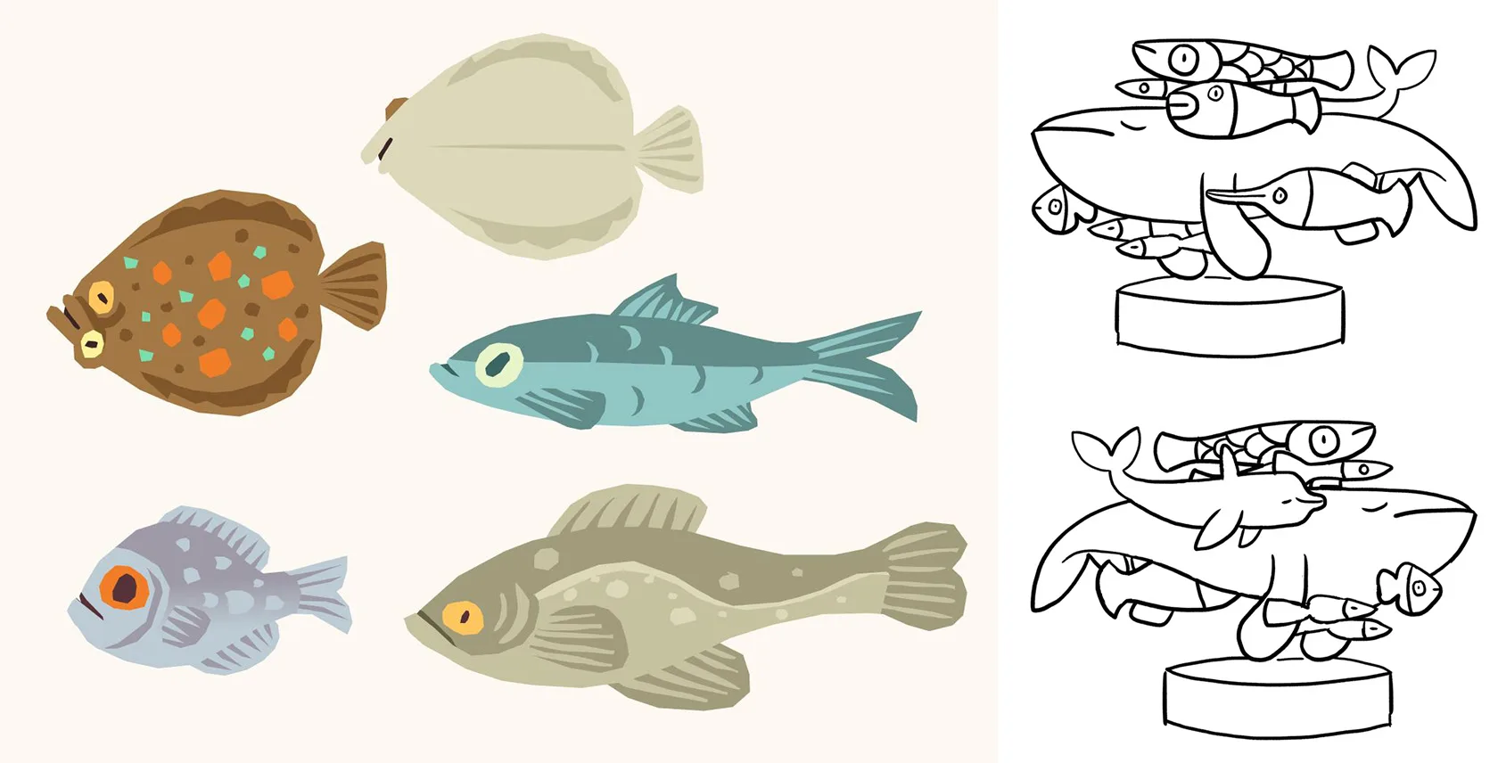
This was a fun game to art direct because it has so much stuff in it. It is a game about looking really closely at objects and they all needed designing.
Note. There are big spoilers here, in case you haven’t played the game and are planning to.
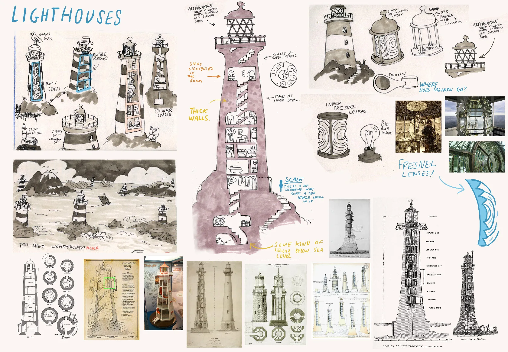
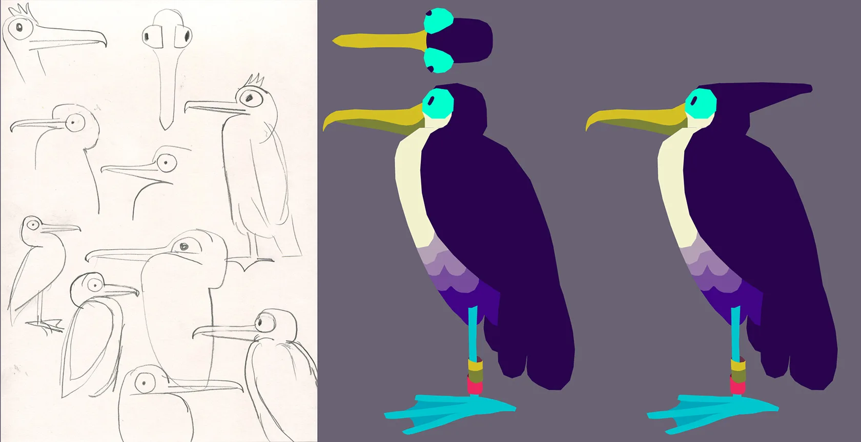
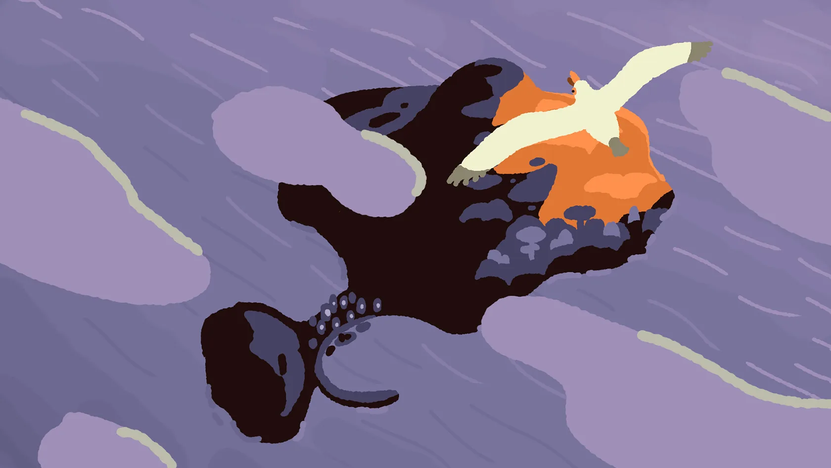
Too many lighthouses? NEVER!
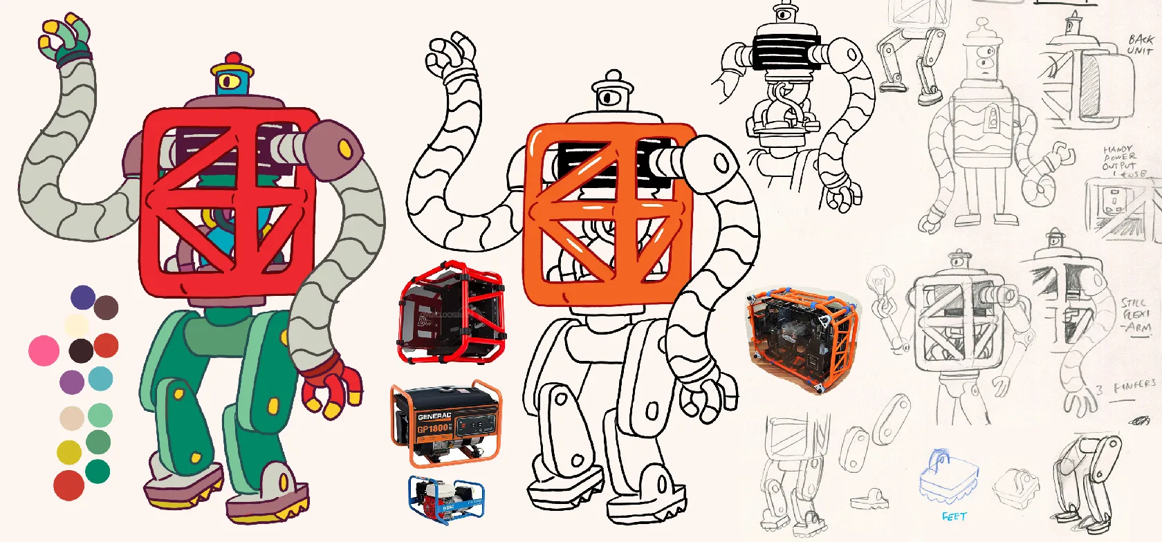
I really enjoyed designing this. I’d love to do more robots.
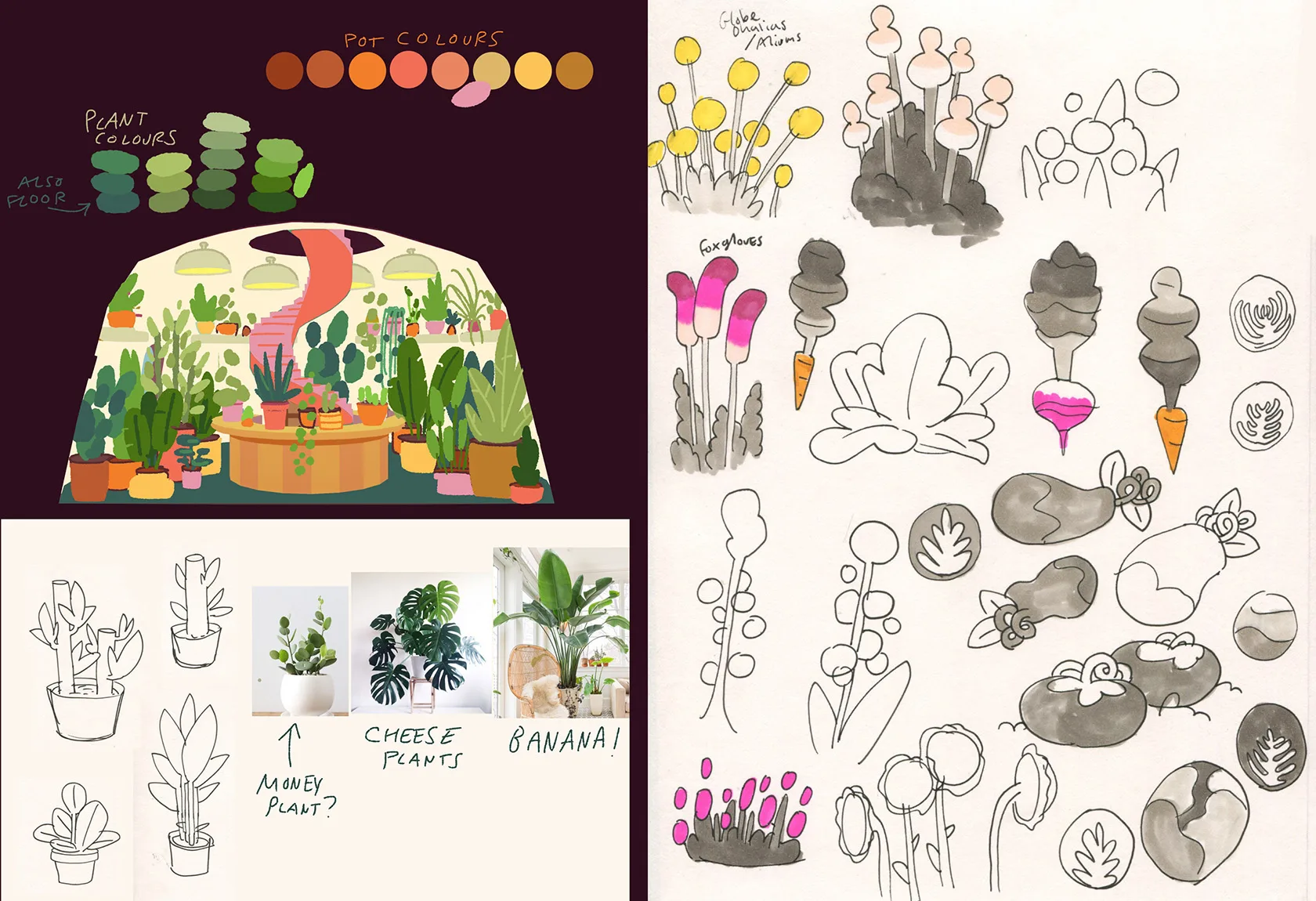
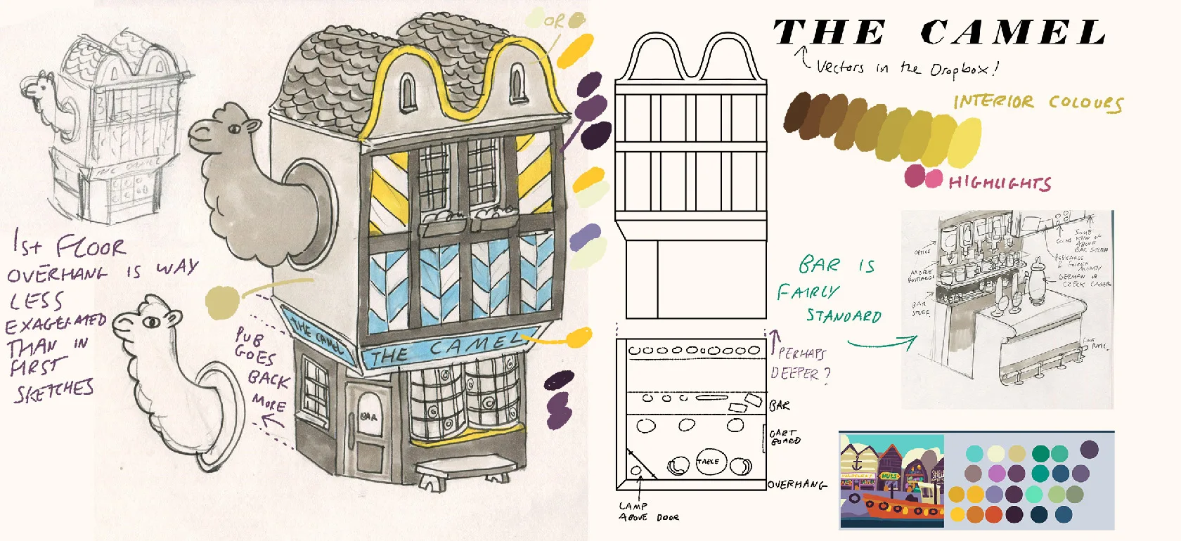
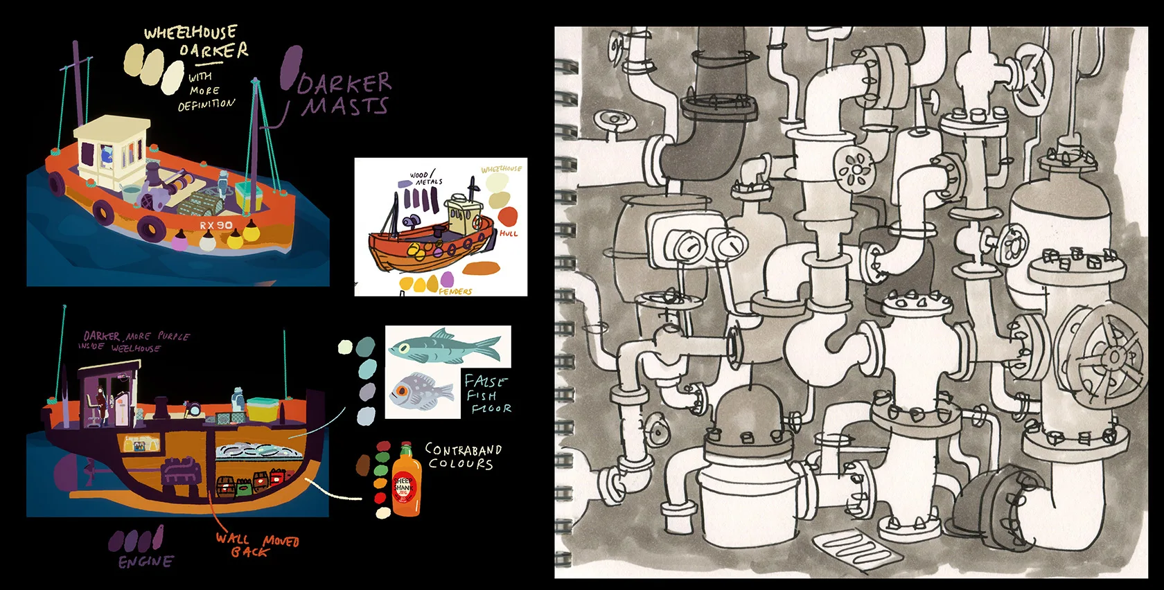
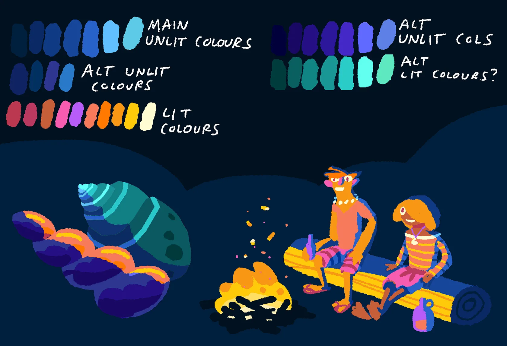
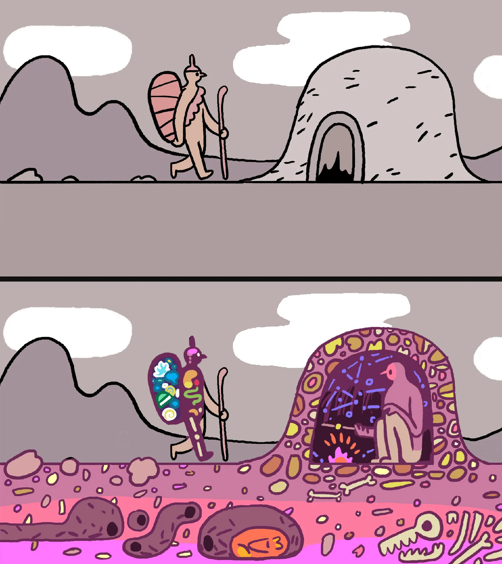
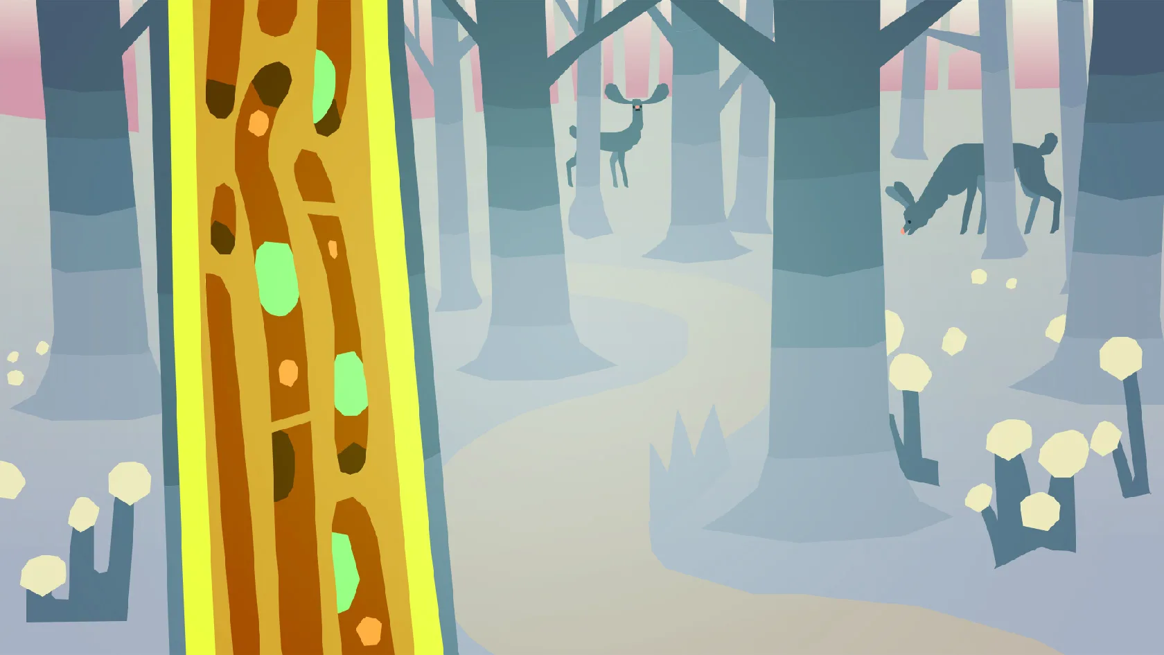
Coming up with functional, quite strict colour palettes was one of the biggest challenges on this game. I remember this quite rough, but effective drawover of the lighthouse plant room was one of my first big breakthrough in terms of getting the colours right.
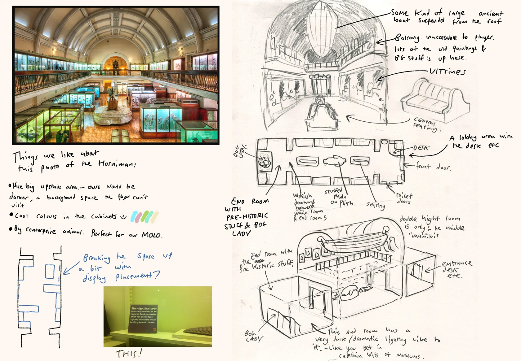
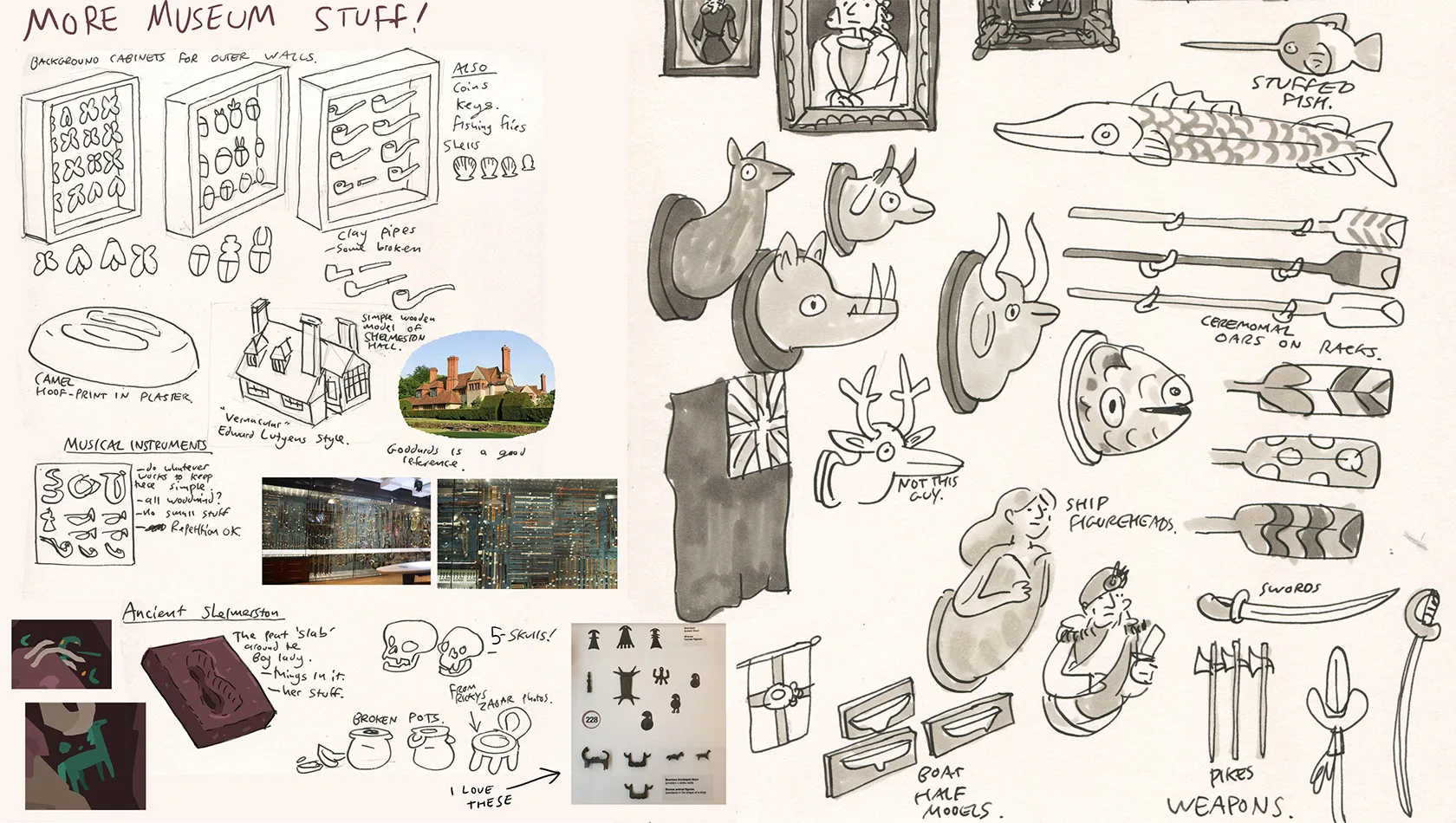
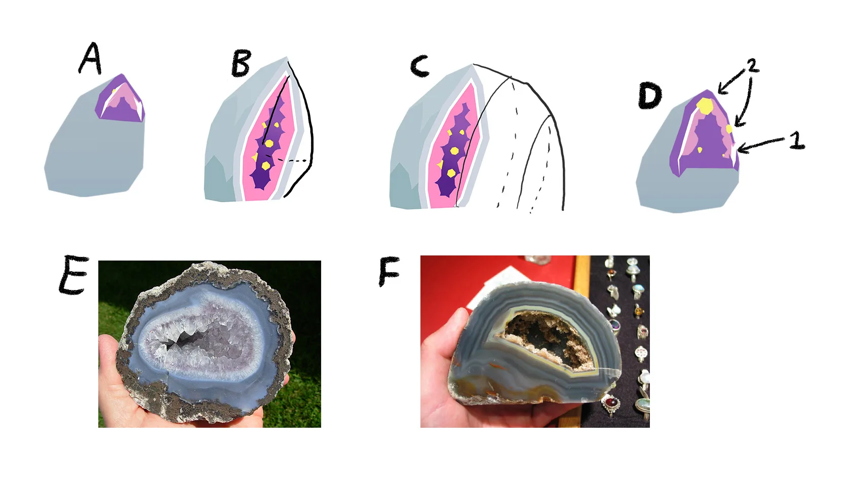
I love museums! A thing I noticed is that a lot of museums do this thing of having really mad, bright coloured backgrounds in their displays where everything except the artefacts is painted violet or orange. Also, Big love to the Horniman museum!
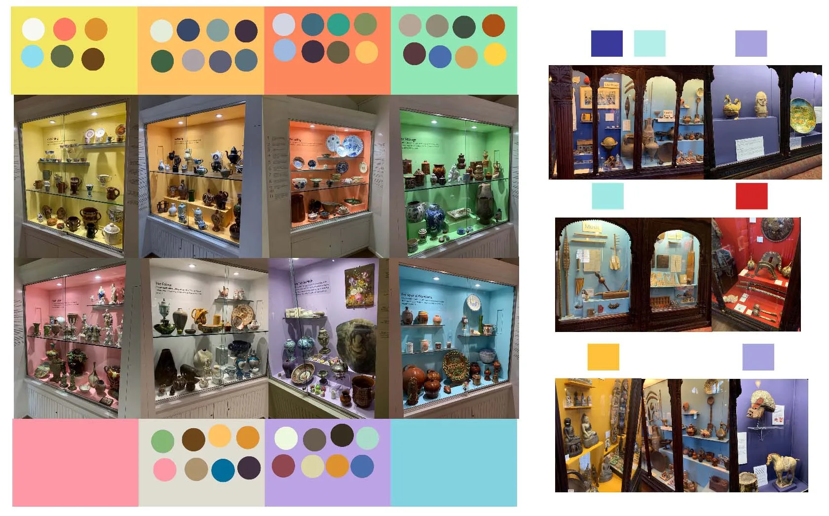
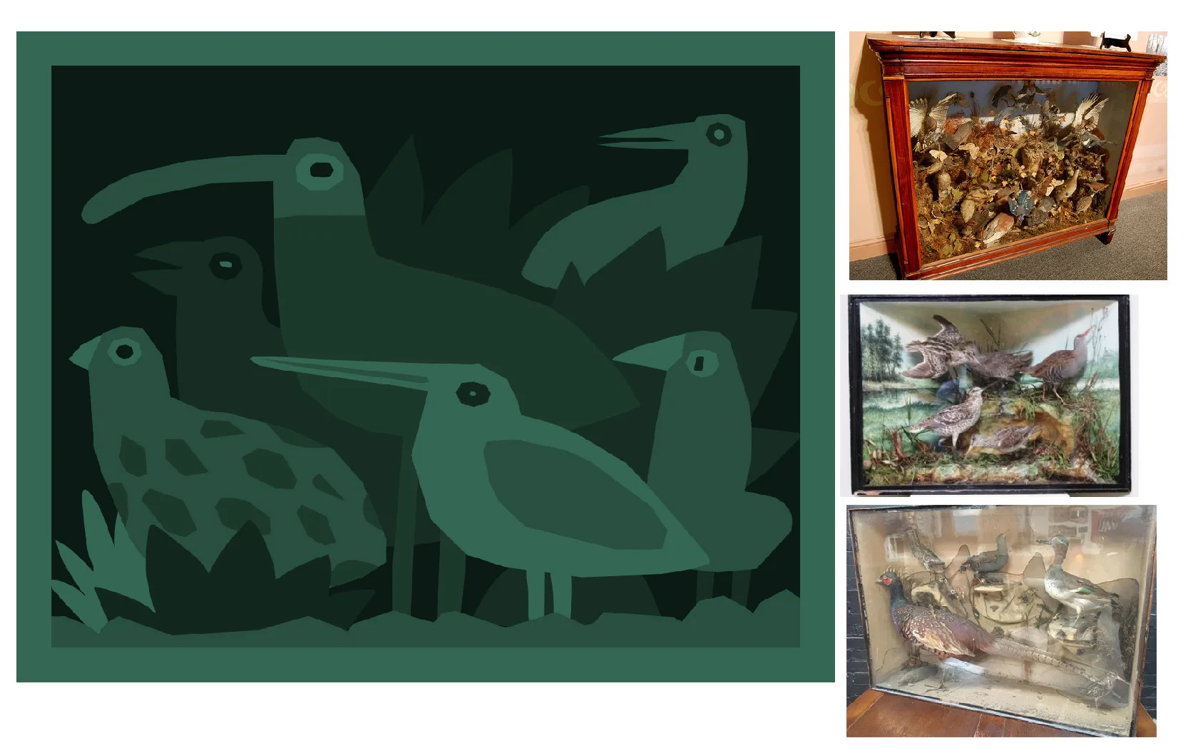
More mad museum cabinet colours. This time from Hastings Museum.
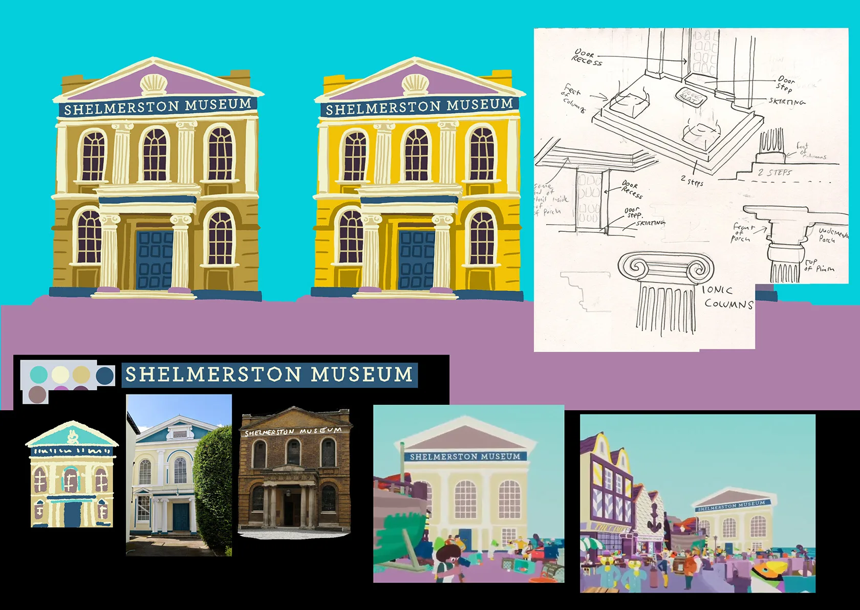
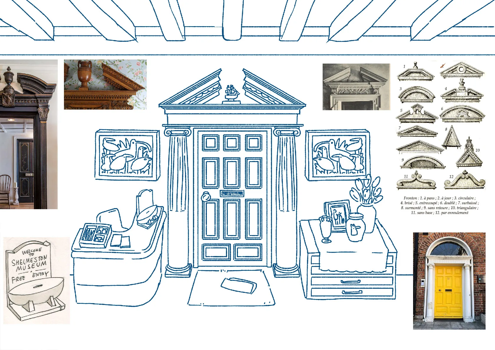
This is the front of the museum, which you only actualy see in one of the trailers, not the actual game.
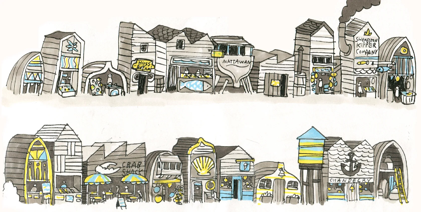
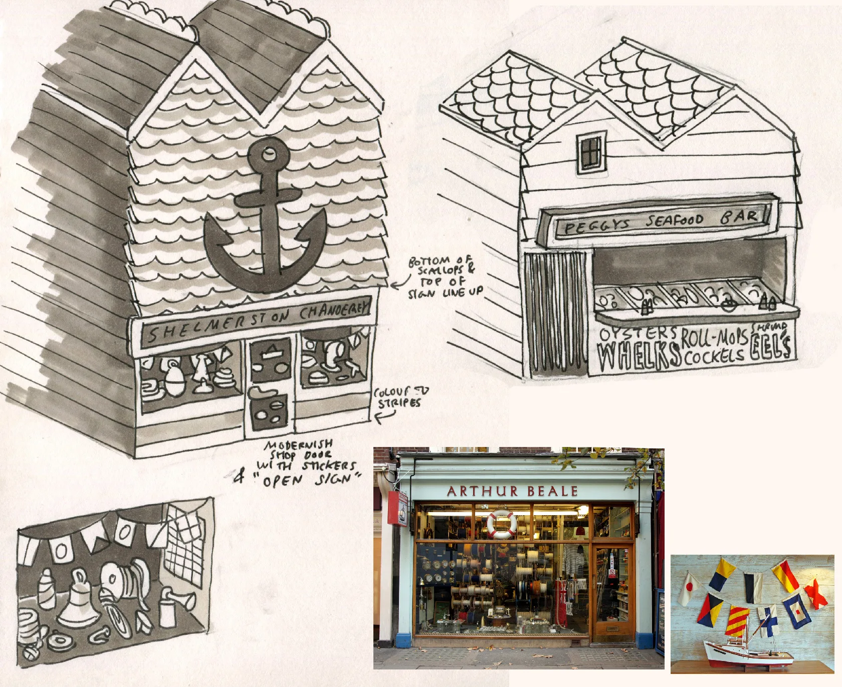
Who doesn't like a mooch in a ships-chandlers?
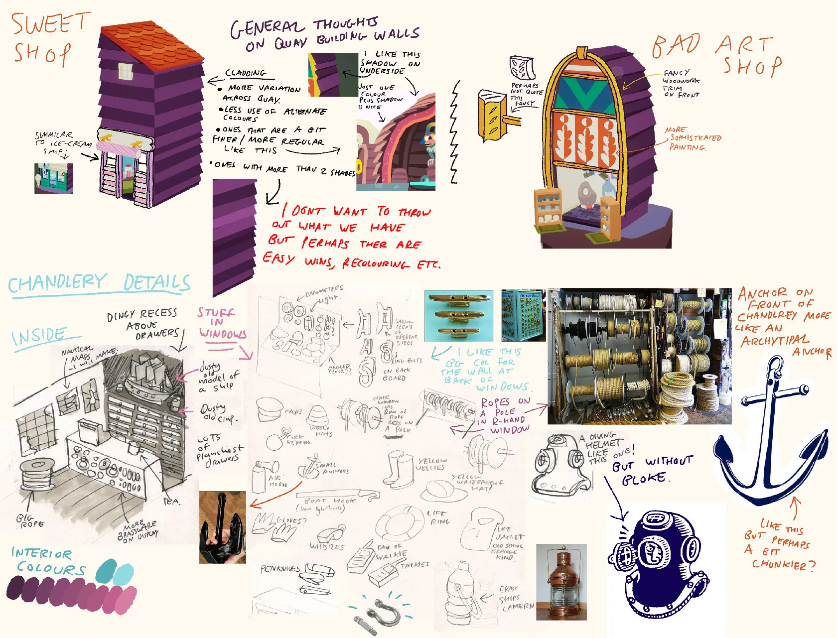
More chandlery!
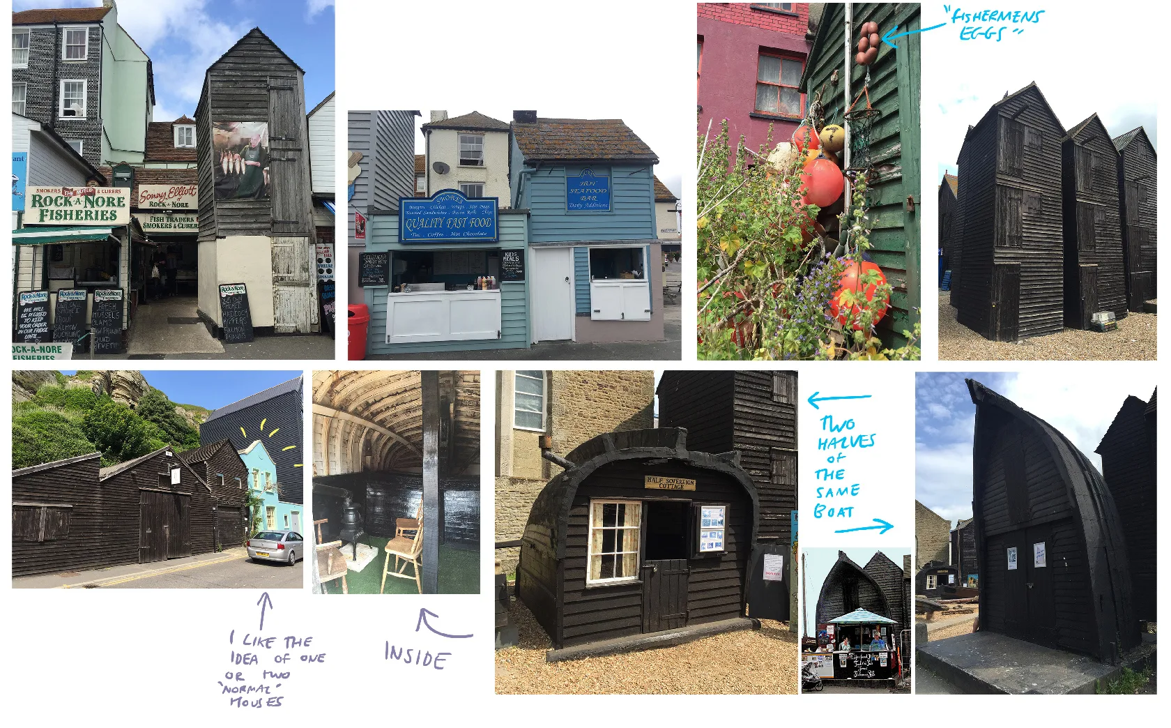
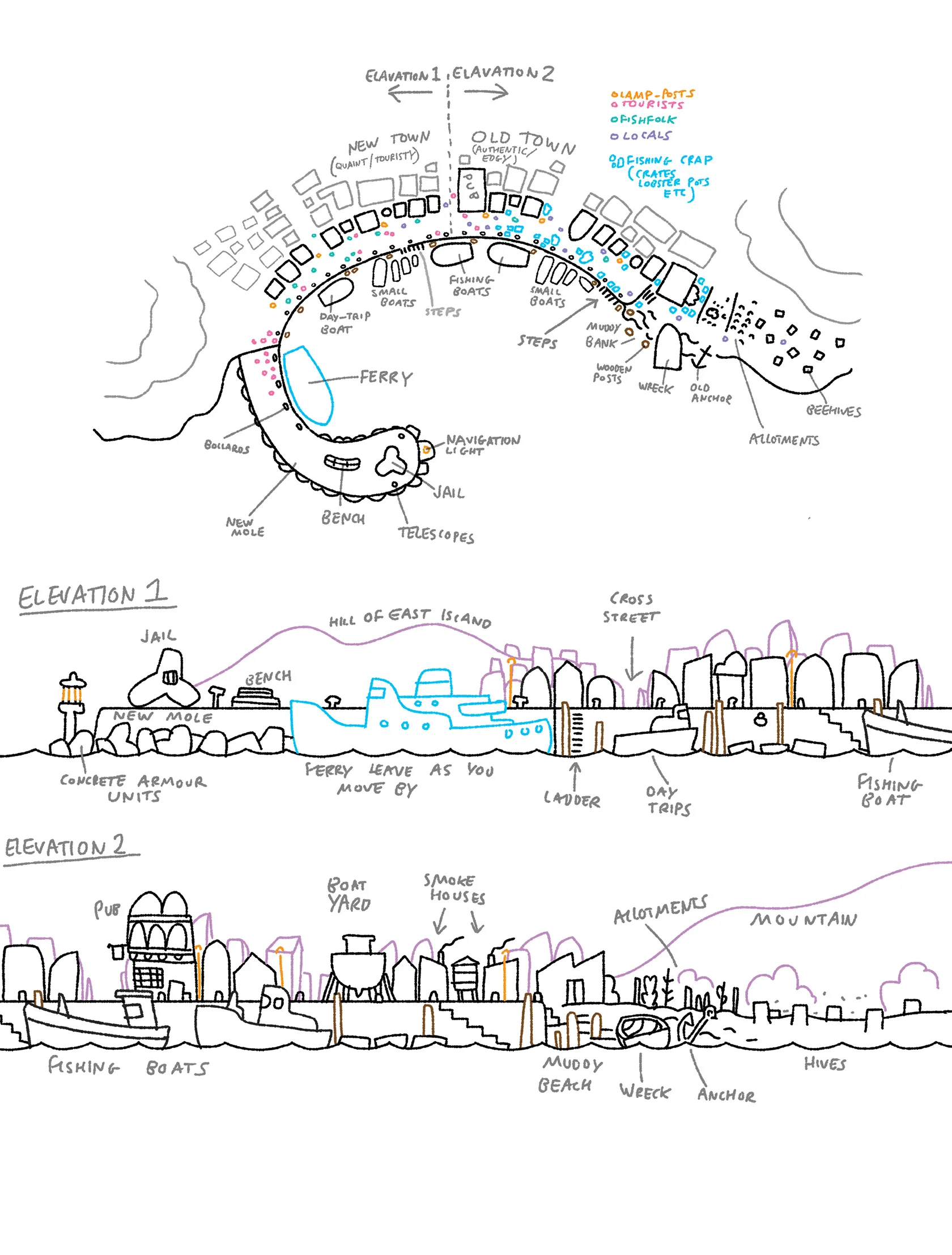
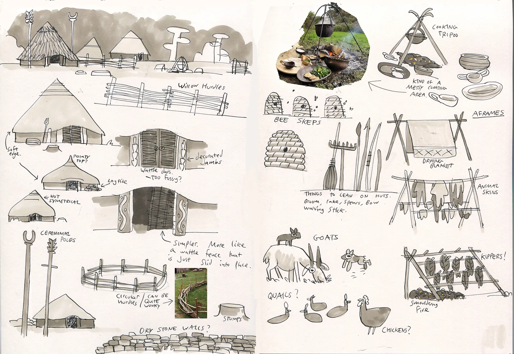
Hastings Old Town was a big source of inspiration for this game.
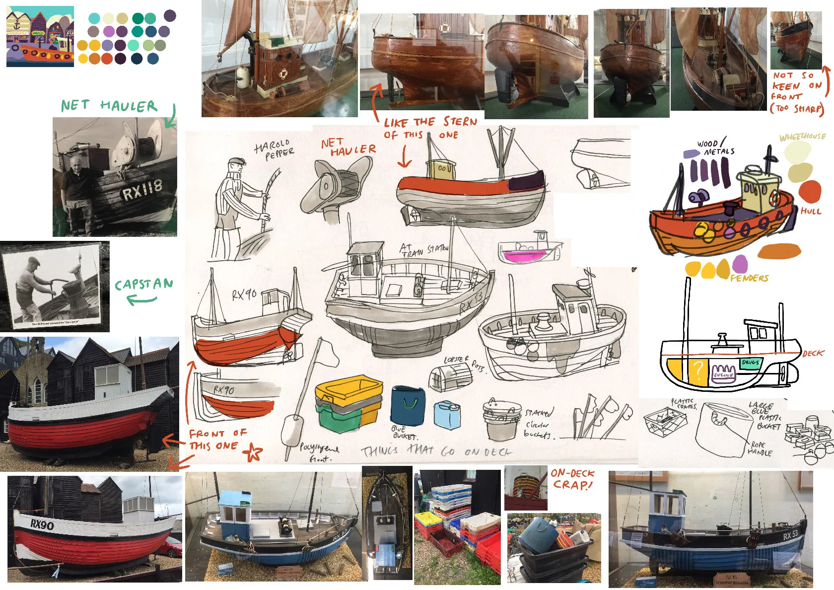
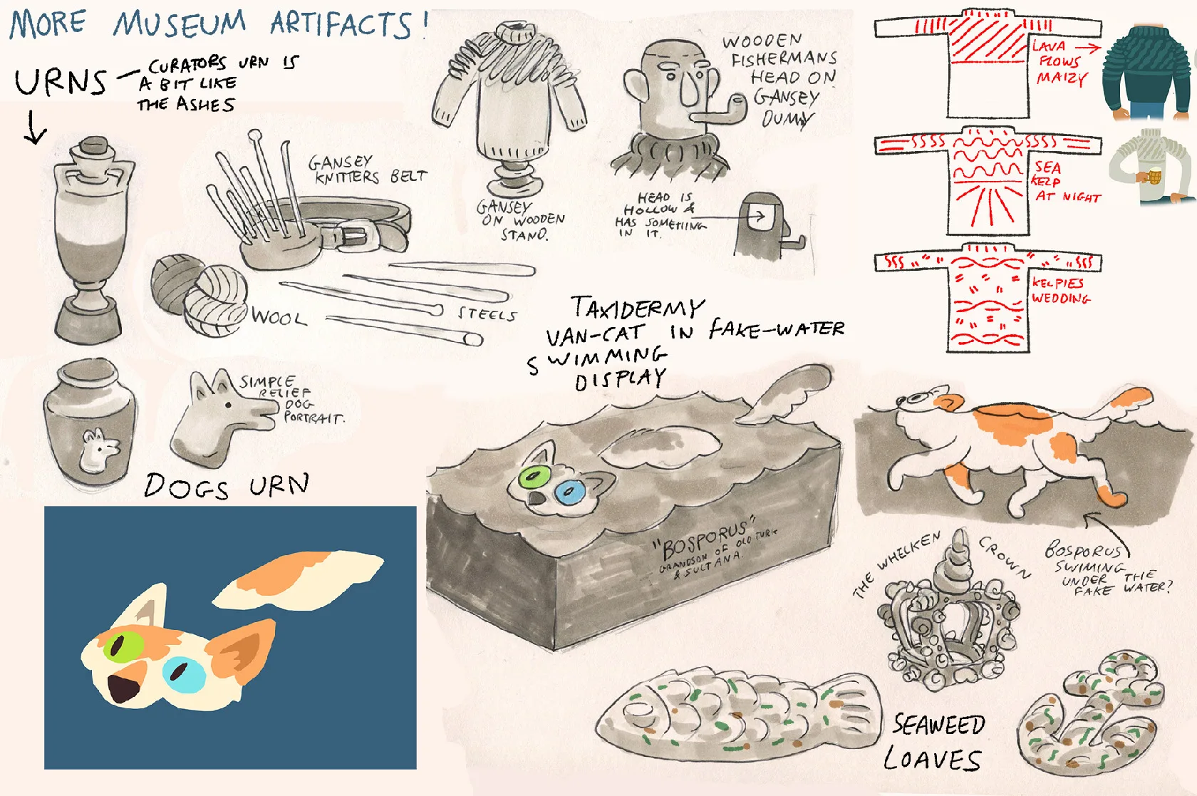
Days were spent at the Hastings Fishing Museum.
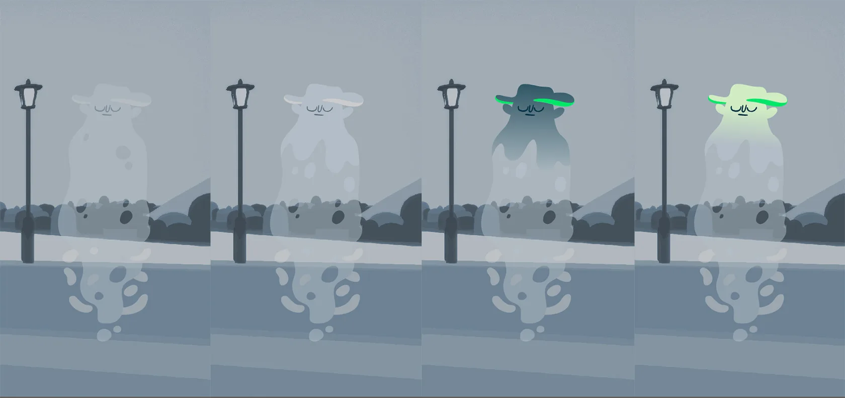
This is a draw-over where there is almost nothing left of the original screenshot.
We are getting into big spoiler territory now, in case you haven’t played the game.
Goats, chickens? KIPPERS!
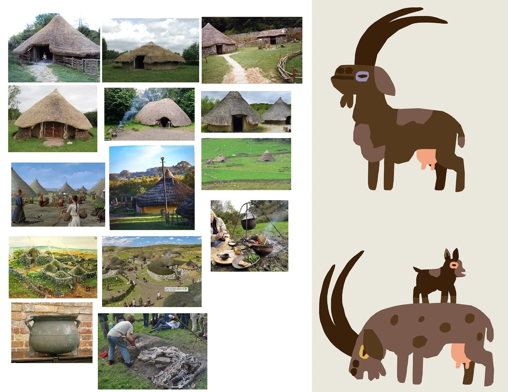
GOATS!
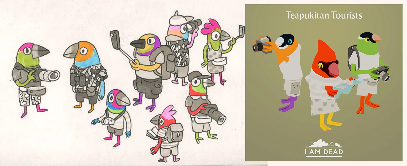
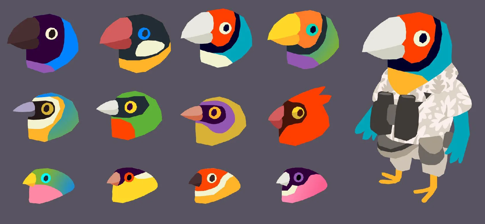
I think it’s cool to be a total tourist. I wanted to celebrate that.
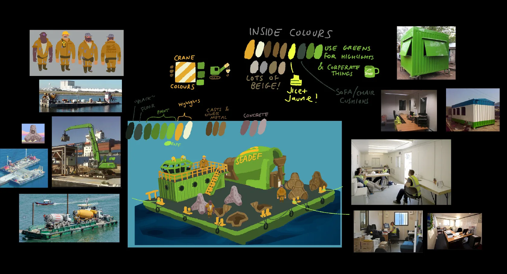
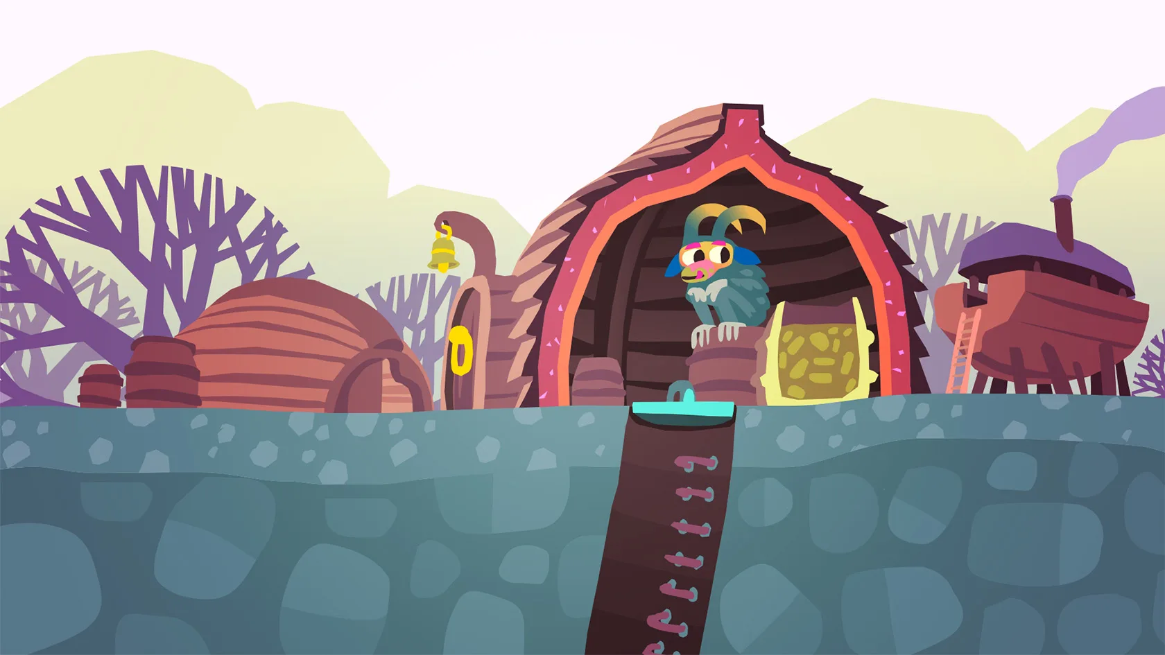
Portacabin where construction-workers hang out on their breaks is such a vibe.
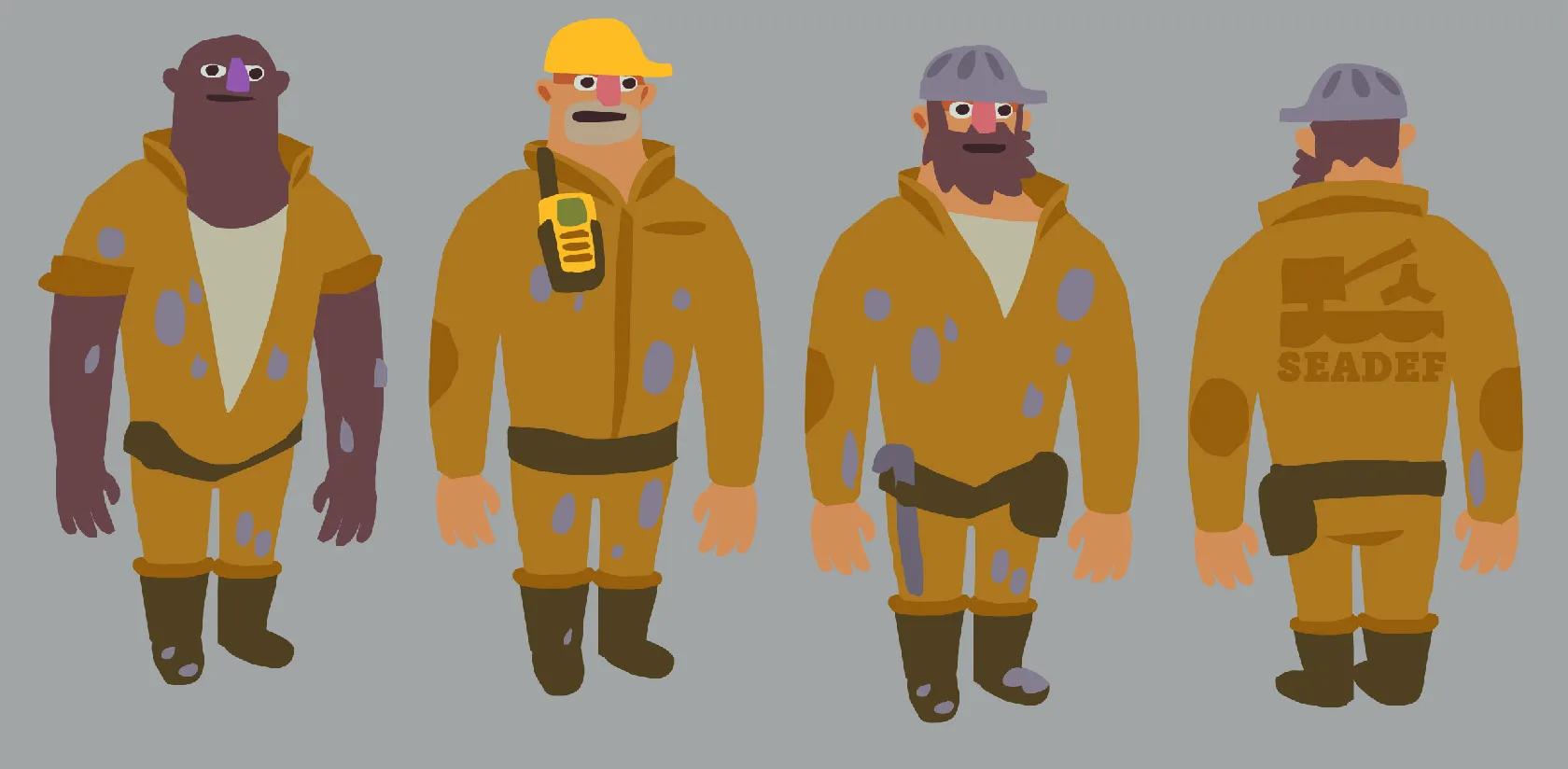
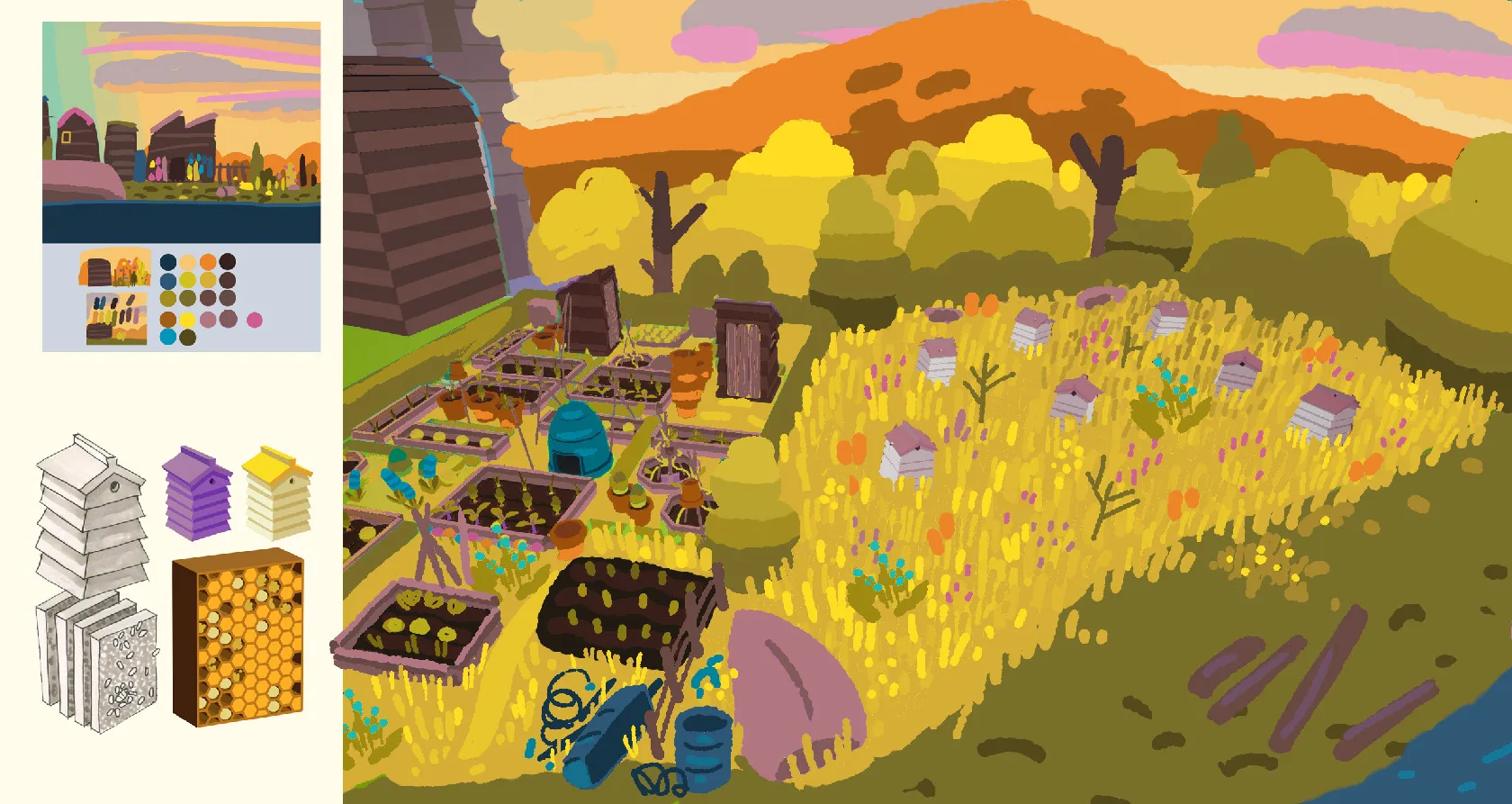
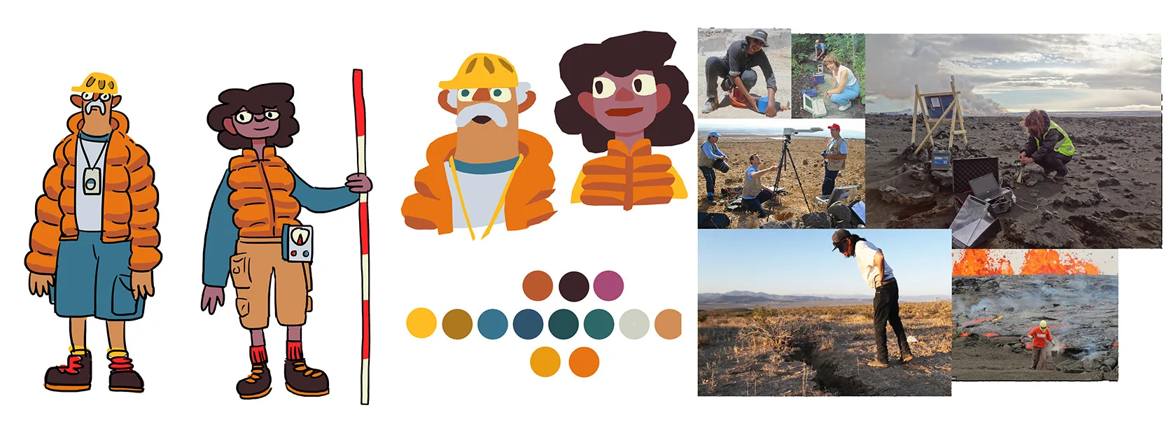
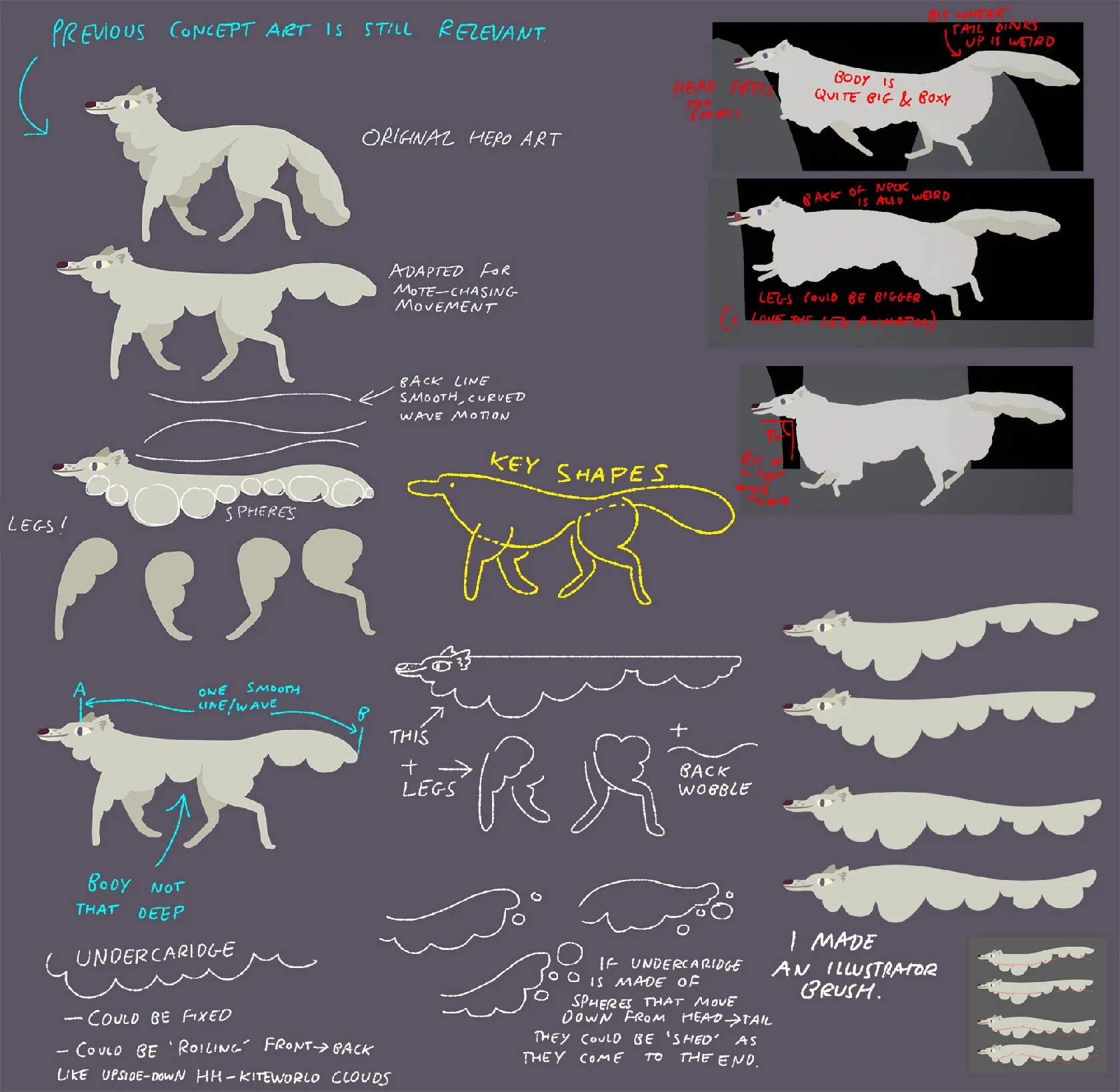
When we made I Am Dead I had no 3D modeling experience and had never worked on a game with three-dimensional art assets. Fortunately the unshaded lowish-poly art-style meant that I could still create concept art that was near-identical to how the final assets look in game.
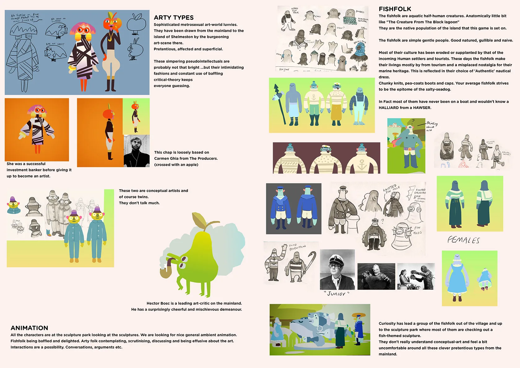
I don’t really feel this way about artists. Some of my favorite people are artists.
Really early concept art. Trying to get across the ‘slicing’ mechanic that is at the core of the game.
More early concept art.
Getting closer to the look of the final game.
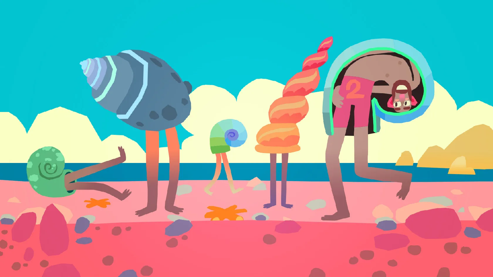
This slicing thing is hard to explain in still images.
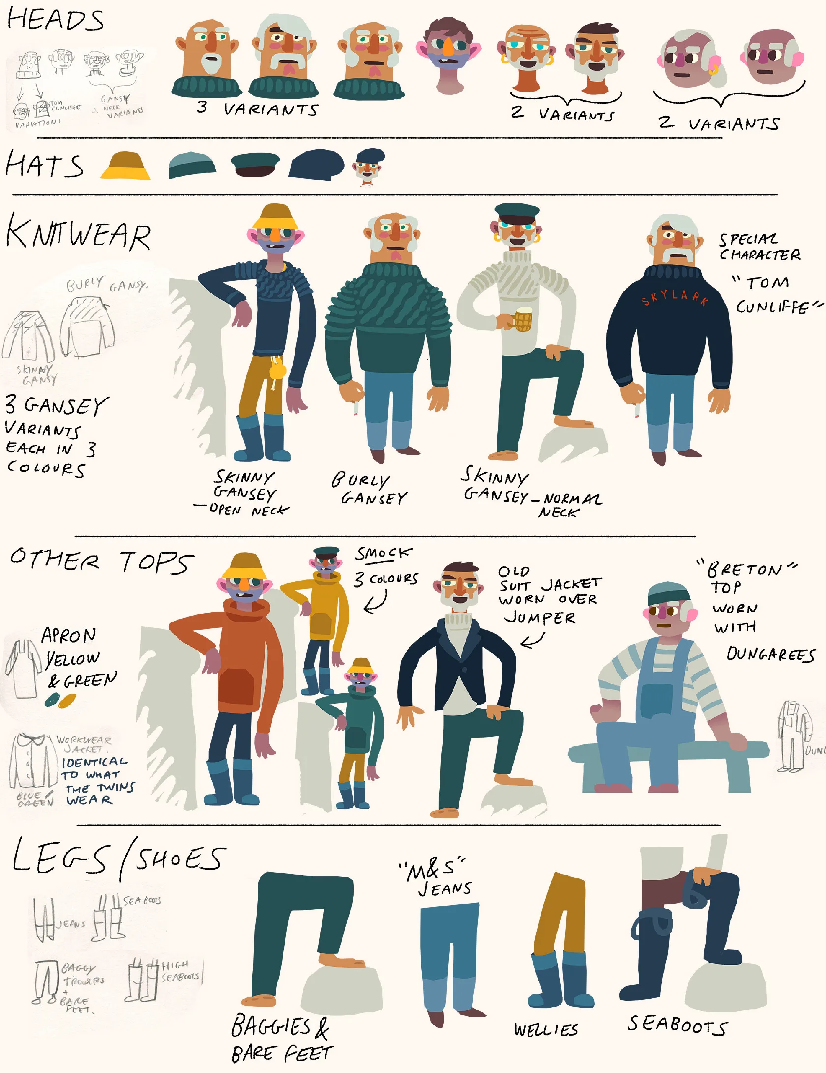
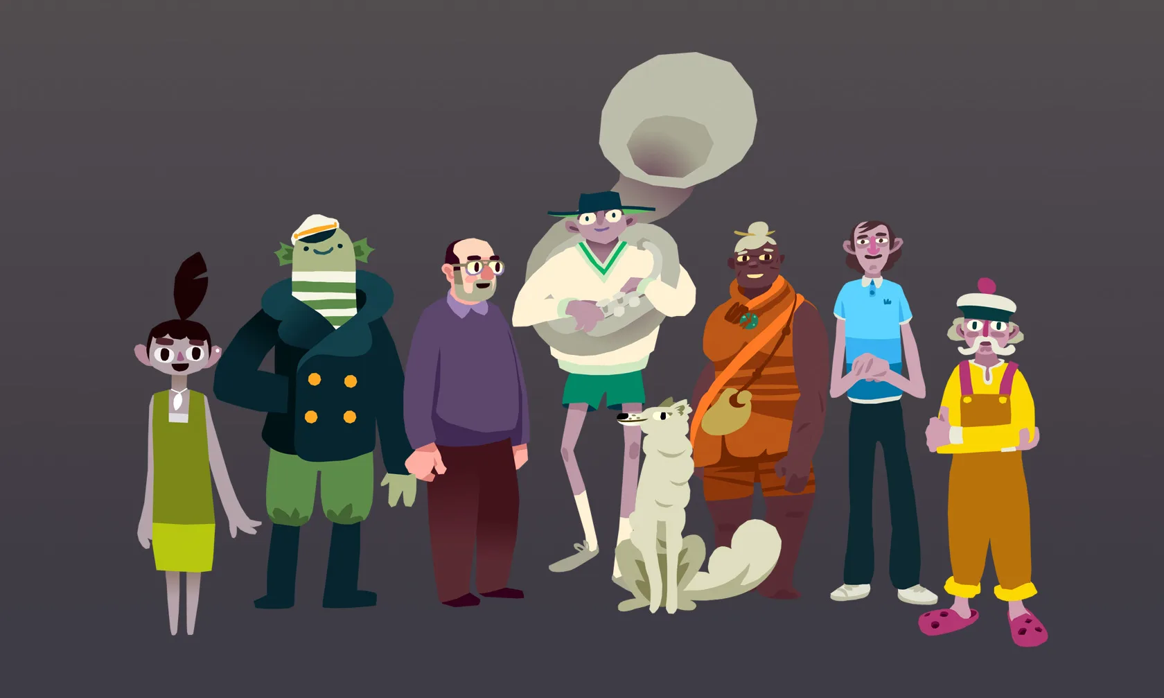
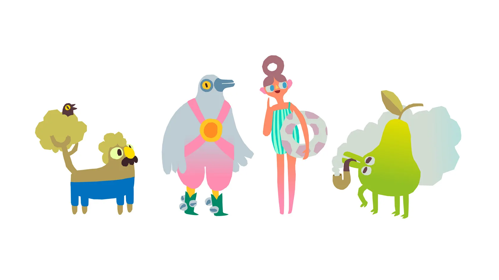
This was quite early and yet these guys made it into the game.
Did you know that the cross-thing morris dancers wear is called a baldrick?
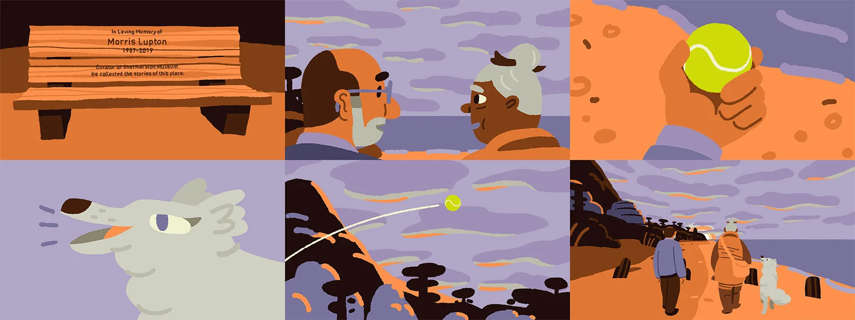
The game has a 2D animated end sequence. Here are some designs for it.
Goodbye Shelmerston.